- Design systems
- MUI
- Accessibility
Migrating a healthcare product suite to one scalable design system
Foundations, an Material Design System migration, and governance across every product area.
At a glance
Role
Design systems lead
Collaborators
- Design team
- Front-end engineering
- Accessibility review
Timeline
Multi-quarter
Impact
- Established foundational design guidelines
- Bootstrap → MUI migration
- WCAG AA baseline
Context
Before this initiative, most of the designs were put together by the engineering team. This was the ideal situation to establish the design system from a primitive level starting from
- Typography
- Color palette
- Spacing conventions (8pt scale)
- Radius
Accessibility Considerations: Key considerations were to make sure all colors met WCAG color contrast standards of at least 4.5:1 as well as making sure the font scales were legible even in the smallest of texts such as labels and tooltips.
Constraints
- To ease the constraints of design and development, the existing design structure had to be considered in every step.
Key decision 01
Bootstrap to MUI
When determining which component library to use as a base, I created a matrix comparing the top contenders to evaluate the level of guidelines/documentation and the range of components each library had as well as the ease of customization to cover the necessary use cases for our suite of products.
After comparisons and discussions with between design, product, and engineering, we landed on two top libraries:
- Material Design System
- Ant Design System
Both having a robust library with expansive variants as well as extremely detailed documentation and examples both on the design and development front. Ultimately some of the major factors leading us to move forward with Material was the general design aesthetics as well as their dynamic labels on their fields, allowing us to keep the interface less cluttered with labels, especially with our products having input field heavy pages.

Key decision 02
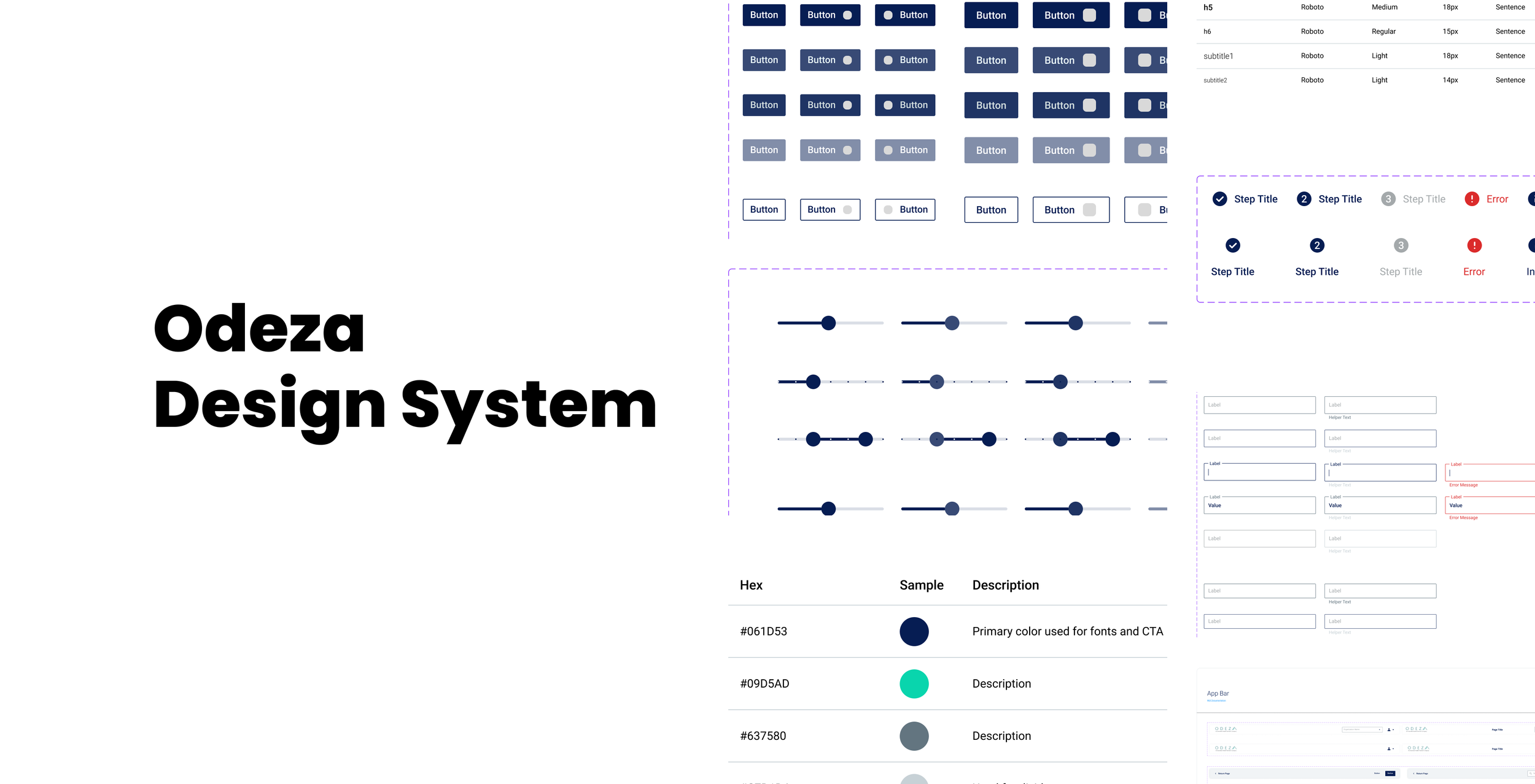
A component library built for every situation
Buttons, fields, and controls
- Text Fields
- Dropdown Menus
- Multi-Select
- Search Bars
- Buttons (w/ and w/o icons)
- Checkboxes and Radio Buttons
- Toggle Switches
Navigation and page layout
- Primary and Secondary Headers
- Footer
- Sidebar Navigation
- Cards
- Input and Confirmation Modals
- Accordions
- Steppers
Status components
- Progress Bars
- Banners
- Toast Notifications
- Error Banner
- Chips
For each of these components, I created variants to cover all situations, including states:
- Enabled
- Hovered
- Active
- Pressed
- Disabled
- Error
And classes.
- Primary
- Secondary
- Outlined
- Borderless
Key decision 03
Implementation
Every net new design followed the newly developed design guidelines and used the customized MUI components, so new work shipped consistent by default.
The harder part was the back catalog. Retrofitting existing products meant coordinating closely with engineering to fit update stories into roadmaps already full of feature work, prioritizing the screens users touched most and folding the rest into work already scheduled in those areas.
Outcome
- Core components
- 40+Core components
- Variants
- 100+Variants
- Coverage on new screens
- 100%Coverage on new screens