
- 0→1
- UX research
- Multichannel
- A/B Testing
Letting user testing pick the interface for a new outreach product
Dashboard versus wizard, resolved through shadowed UATs rather than opinion.
At a glance
Role
Lead product designer - research through hi-fi
Collaborators
- Product manager
- Engineering
- Customer success
Timeline
3 weeks from prep to execution
Impact
- Interface direction chosen from observed behavior, not preference
Context
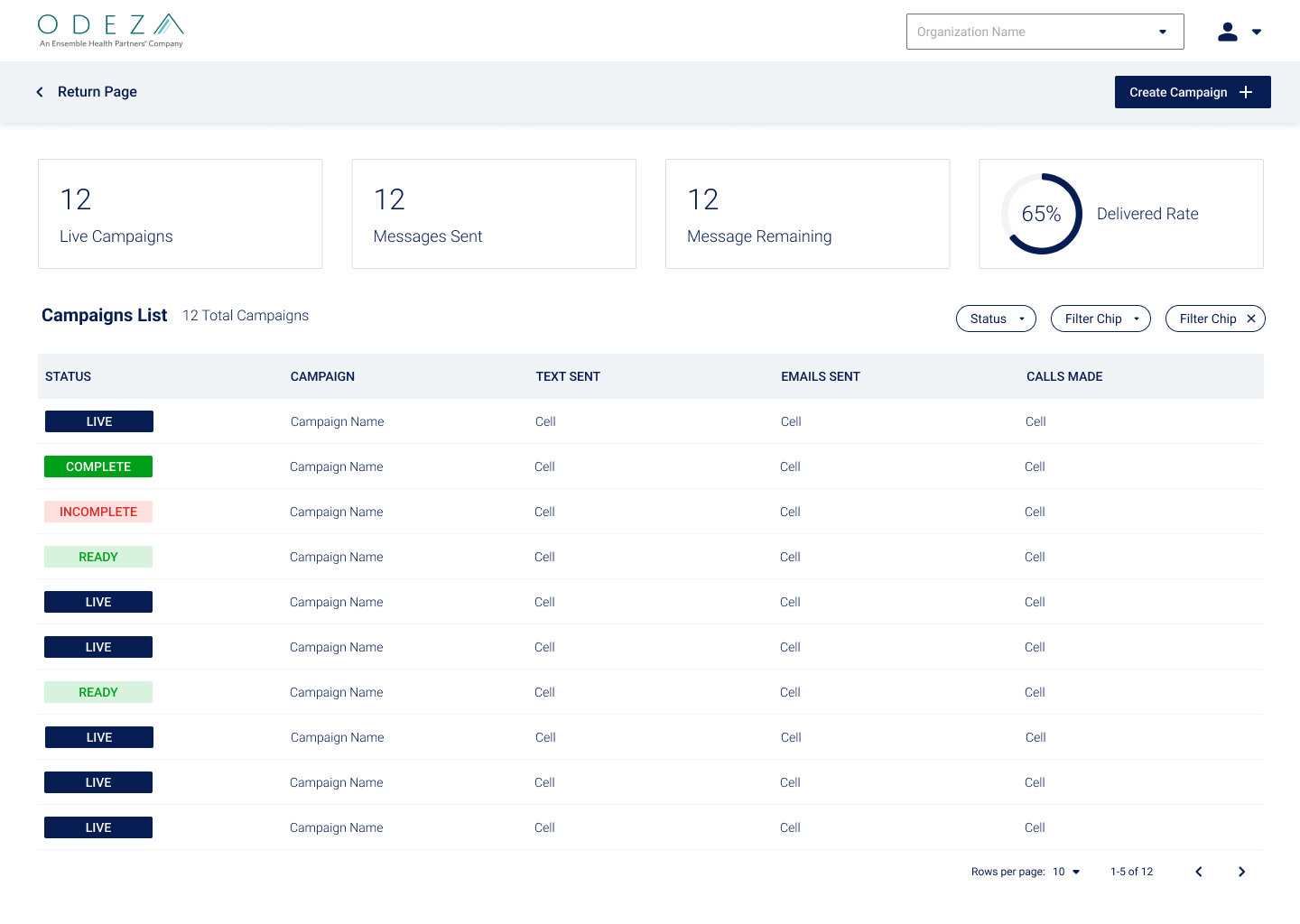
Hospitals desired a single tool to create, schedule, send and track campaign outreaches to their patients via phone, SMS, and email. During ideation, the PM and I designed two potential approaches: Dashboard versus a more linear wizard approach with accordions. Considering the persona of the users, we assumed the dashboard might be a better experience to have all the features on screen at once.
To get real user insight, we conducted A/B testing with the two models as well as contextual inquiry to inform which path would better suite the users' needs.
Key decision 01
The dashboard concept
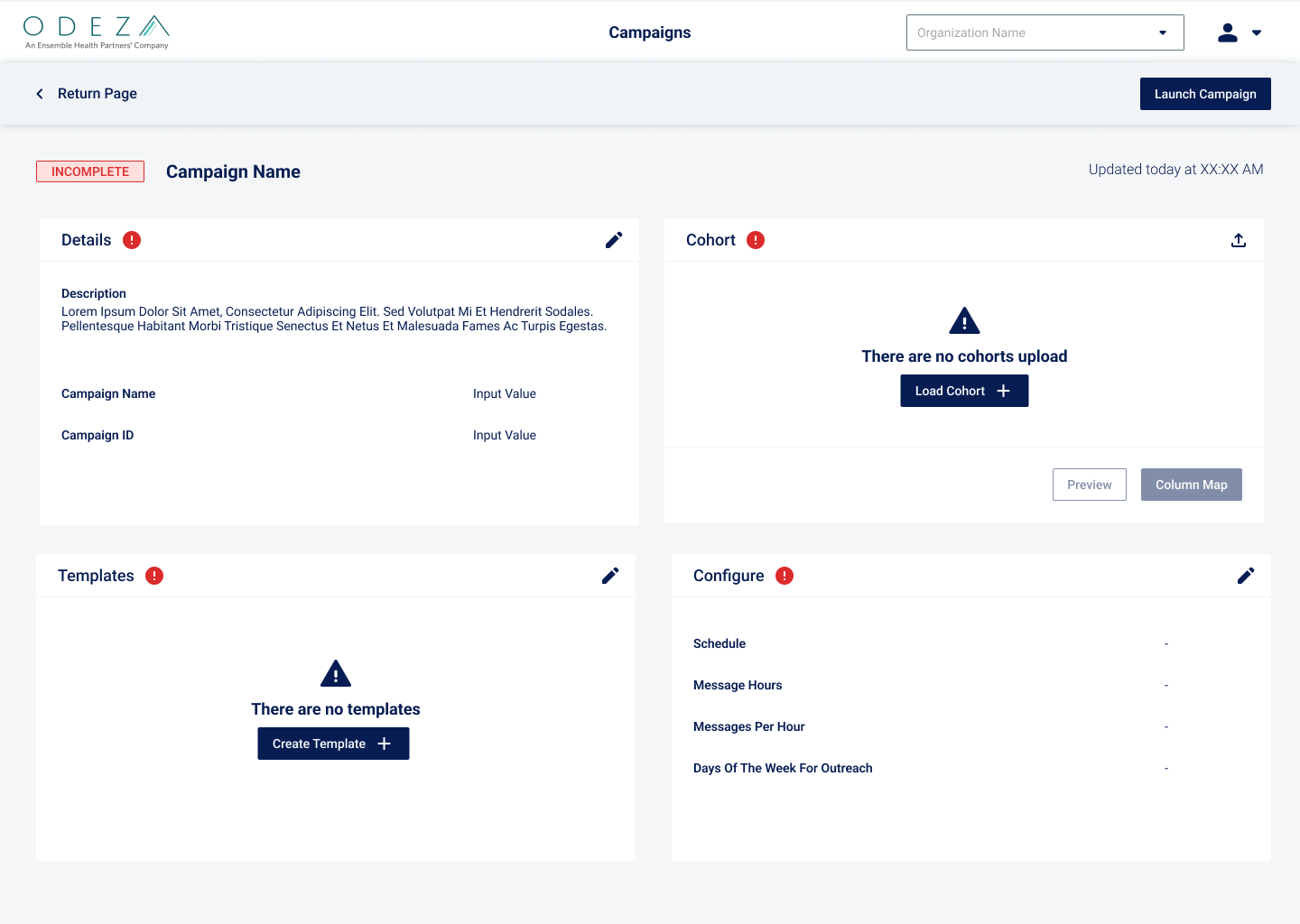
Considering that the persona of the main users of this tool would be power users that will be creating various campaigns, we first designed a dashboard concept where all the components of a campaign is present in one screen.
To make the progress of the campaign clear to the user, a overall status indicator was added to the campaign name as well as badges in the individual sections.
Our initial assumptions were that power users would prefer easy access to features and required less handholding during the campaign creation process.
Key decision 02
The wizard alternative
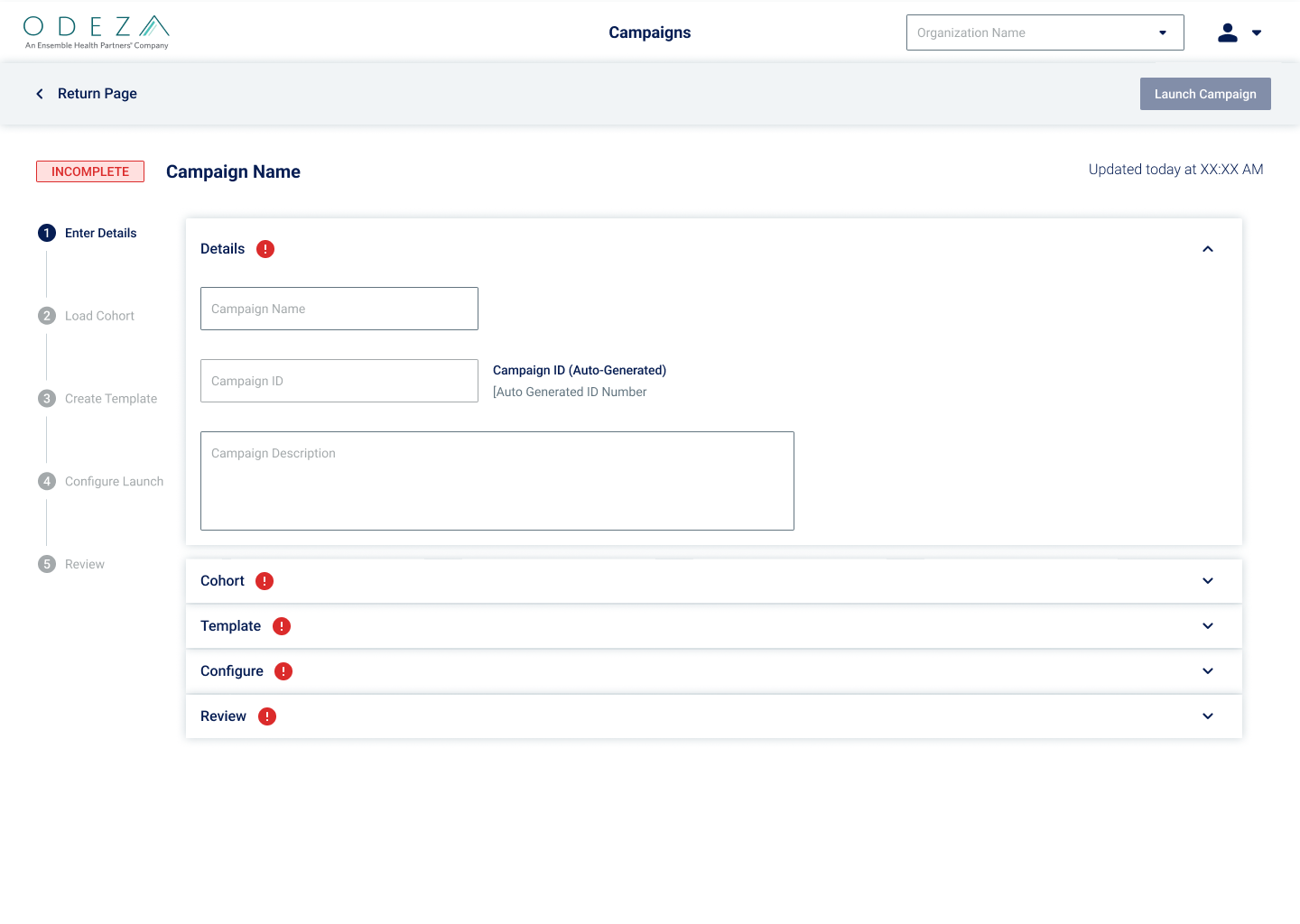
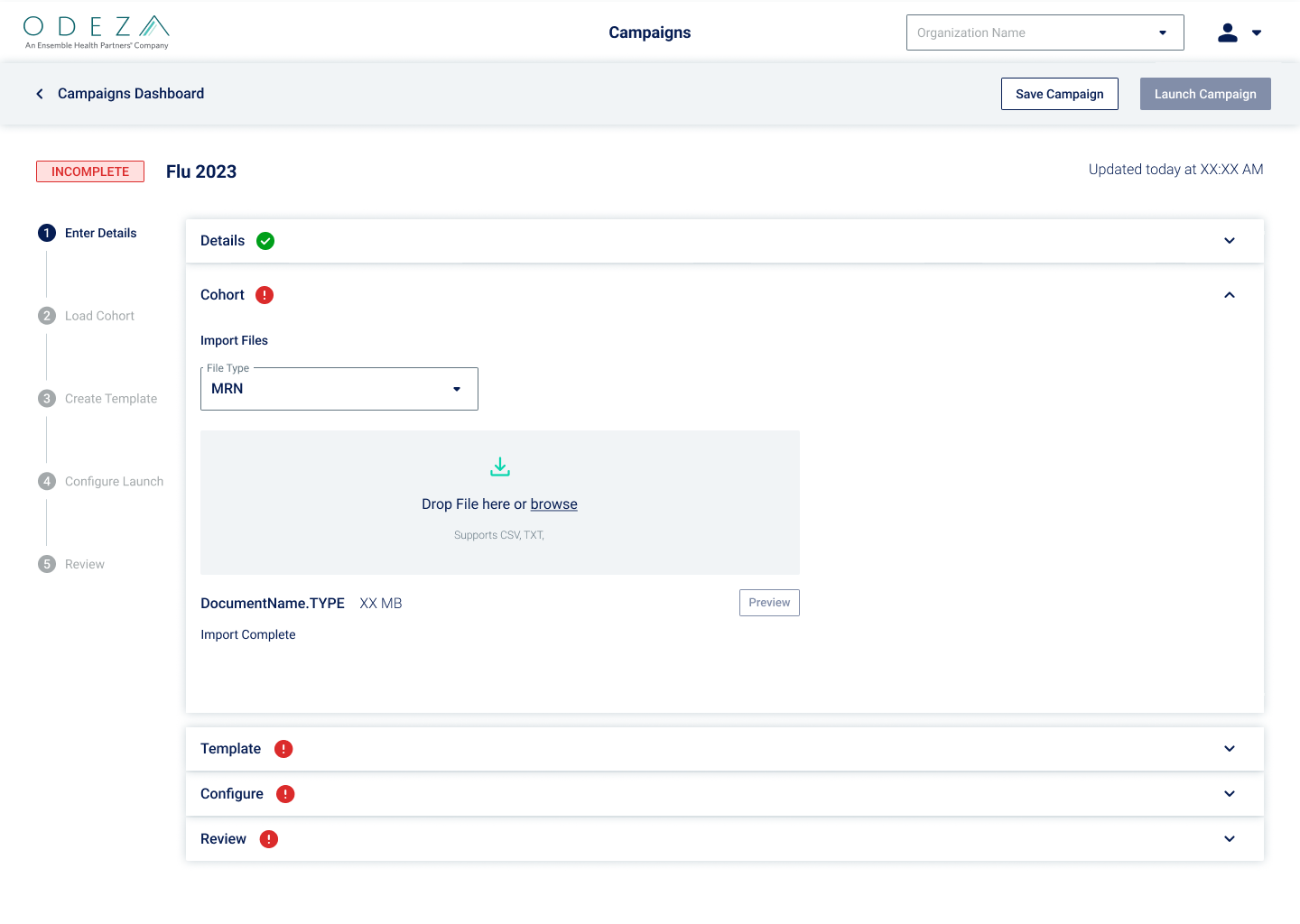
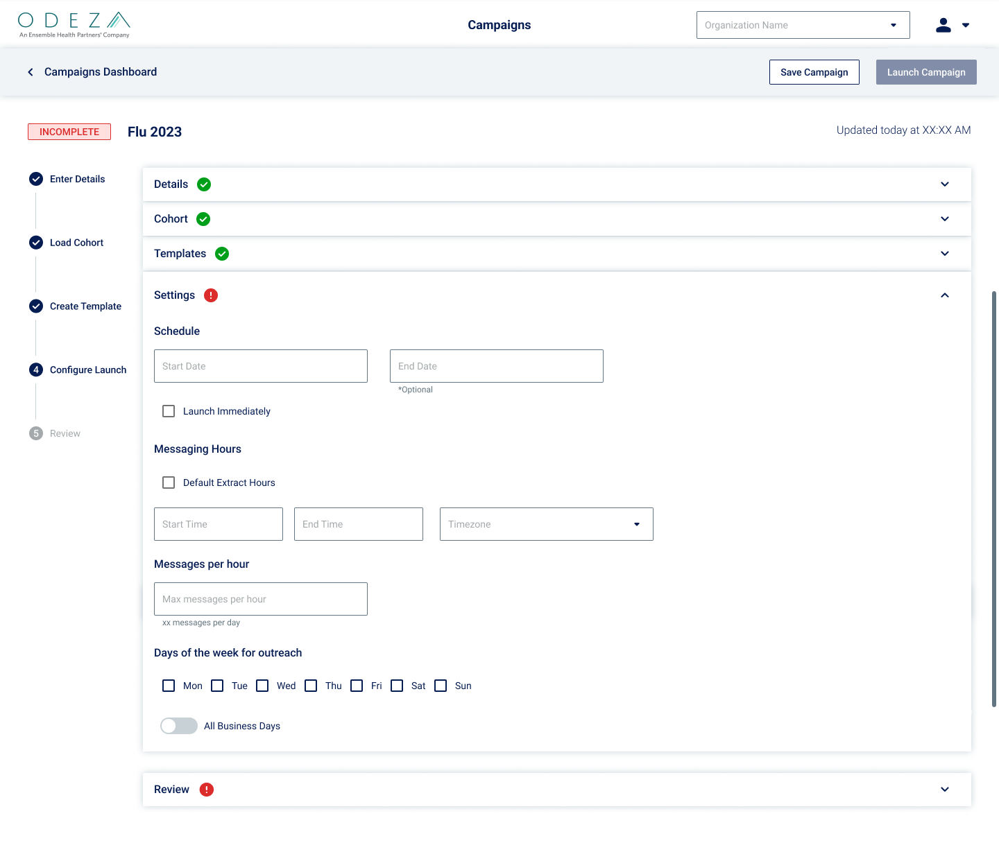
In contrast to the dashboard concept, a wizard concept was creating utilizing steppers and accordions to clearly divide the campaign creation process into individual steps. This linear approach provides more handholding and a visual checklist approach to campaign creation.
Key decision 03
A/B testing
10 hospital staff were asked to think out load while creating a mock campaign for Flu Vaccine reminders on the two Figma prototypes.
Keypoints
- Remind the user that they are not the ones being tested, the product is.
- Regardless of successes or failures, all insights are extremely useful.
- Aside from the users' narratives, where are they looking, trying to click, and paths they are trying to navigate.
Outcome
- Against our initial assumption, users preferred the wizard concept.
- Campaign details arrive in fragments, so users build them piece by piece. The linear wizard makes it clear which steps remain before launch.
- High turnover made the wizard's handholding essential for onboarding new staff.
Reflection
Observing that the testing results contrasted our initial assumptions based on personas, the necessity of user research is undeniable. Though personas are a key consideration of depicting our users, they have their constraints and do not always reflect internal friction points and needs within an organization.